Role: UI/UX Designer, Researcher
Summary
Why This Project?
League of Legends is notorious for not being beginner-friendly. Third party tools exist, but are mostly geared towards hardcore players. I saw a gap in the market for beginner players. The main current tool is YouTube, but it isn’t easy to quickly scan for build guide or strategy tips during a game.
How I Conducted My Research
Through interviews, I learned that beginner users prefer playing (socially) with people they know. This led to me pivoting my product to a learning platform similar to Skillshare, but with added social features.
During 2 rounds of usability testing, I learned that Users want a supportive group of like-minded players to queue with, and that in-game resources don’t provide enough support for beginners. From my interviews, I learned that users who wanted to improve turned to YouTube and grinding ARAM games to improve through sheer time spent playing.
I also learned form interviews that beginner players didn’t know how to use LoL learning platforms because they threw lots of information at users without enough context for beginners.
Key Learnings
It’s important to deeply understand users. From my interviews, beginner players indicated that they prefer to play in a group of friends of family. Because of this I pivoted my product to be a Skillshare-type platform instead of creating a traditional site with build guides and counter matchups, but for beginners.
Always look for feedback. There were multiple times through the process that critique I received in group critique sessions improved and kept my designs on-track. As mentioned above in the wireframing section, the header I originally designed was confusing and cluttered, but after getting advice from my peers, I was able to simplify it to one that emphasized the search bar while moving the account button to the hamburger menu.

Setting the Stage
Since its creation in 2009, League of Legends has been notorious for not being beginner-friendly. With 180 million active players a month in 2022, the game is continuing to attract new players. Third party tools and websites have sprung up throughout the years to help teach players, but are mostly geared towards hardcore players wanting to maximize their gameplay.
“League never has been beginner friendly you either need to watch how to's, play with a friend that knows the game or just get smashed by smurfs every game...”
-Reddit User A
“…There's basically no guidance in game and players are so toxic that I feel bad for new players trying to learn tbh.
I started playing with my friend who already was playing and he helped me through the learning curve and now I'm around his skill level (low plat) after about 2 years of playing.”
-Reddit User B
“…starting league alone without friends is very hard indeed. There are no official tutorials and nobody explains how things should be done correctly and how you have to play the game the right way. Everything is easier, if you have someone explaining it to you or if you can learn it with others.”
-Reddit User C

How might we help beginner LoL players learn abstract concepts of the game?
Competitive Analysis: Other LoL Learning Platforms
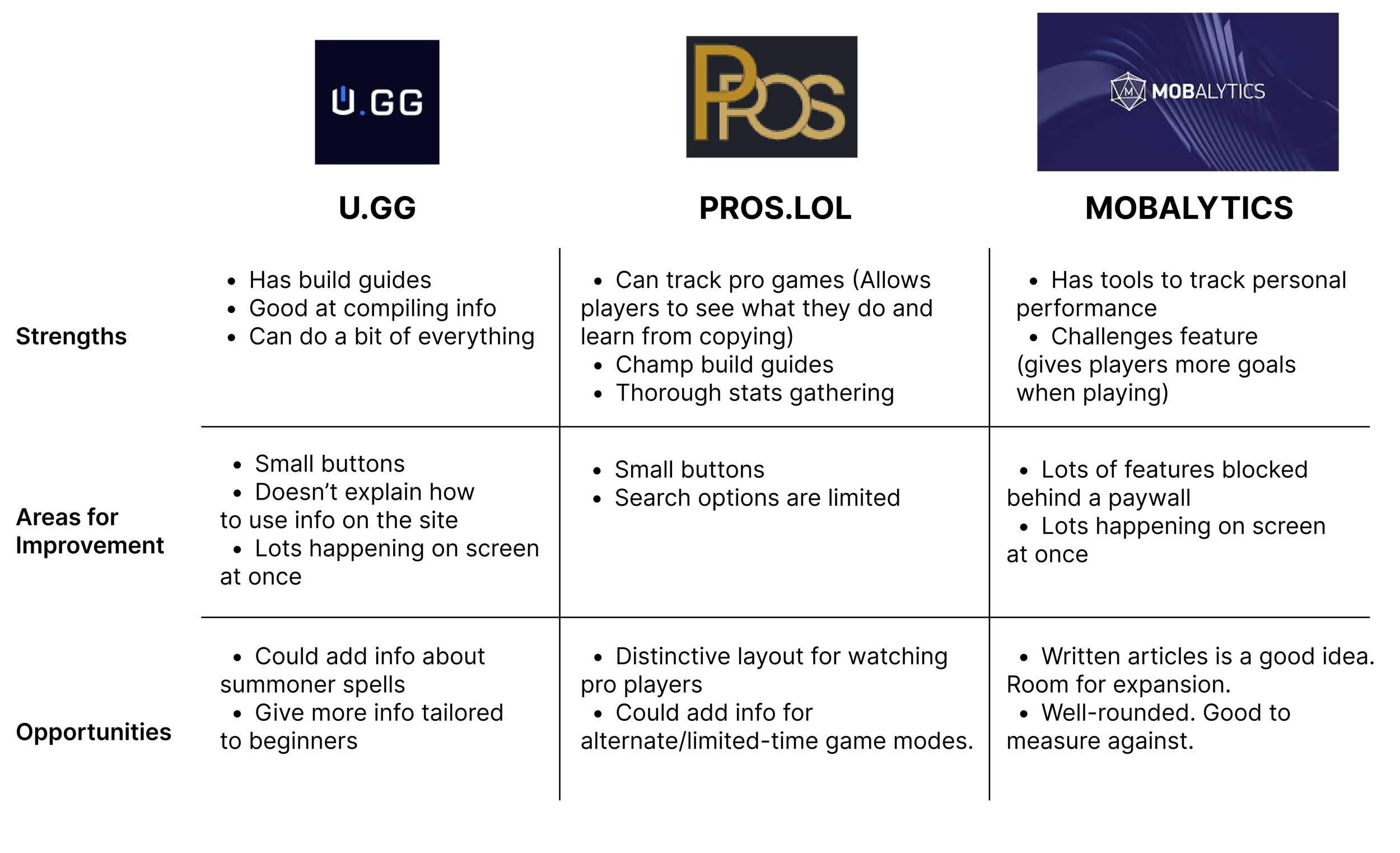
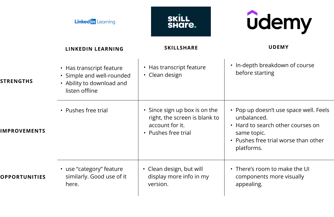
Before I started designing, I needed to see what player resources were already out there. Based on my experience with the game, I knew there were dedicated platforms, in addition to channels on YouTube, where players could go to learn the skills. I decided to focus my competitive analysis on these dedicated lol platforms, to see what resources they provided for beginner players specifically.
Interviewing Casual and Intermediate Players
Now that I found areas of improvement compared to competitors, it was time to interview League of Legends players and see what they said about current online learning offerings.
I interviewed 4 LoL players
2 were beginners and more casual. 2 were intermediate and played more often.
I wanted a mix of perspectives.
Research Goal:
I want to learn what aspects of LoL are hard for new players, in order to tailor solutions to help them better learn the game.
Social Players vs. Competitive Players
Social Players:
Play 1-4 hours a week.
Fit games in around other life obligations.
Are mainly available on weekends.
Interacting with friends and family is biggest priority.
Having a better way to learn is also important.
Competitive Players:
Play 10-30 hours a week.
Looking to quickly improve
Consult build guide sites and YouTube for additional learning.
Few/no life obligations that get in the way of playing.
Each type of player has a different expectation from their experience.
Current Resources Aren’t Adequate for Beginners
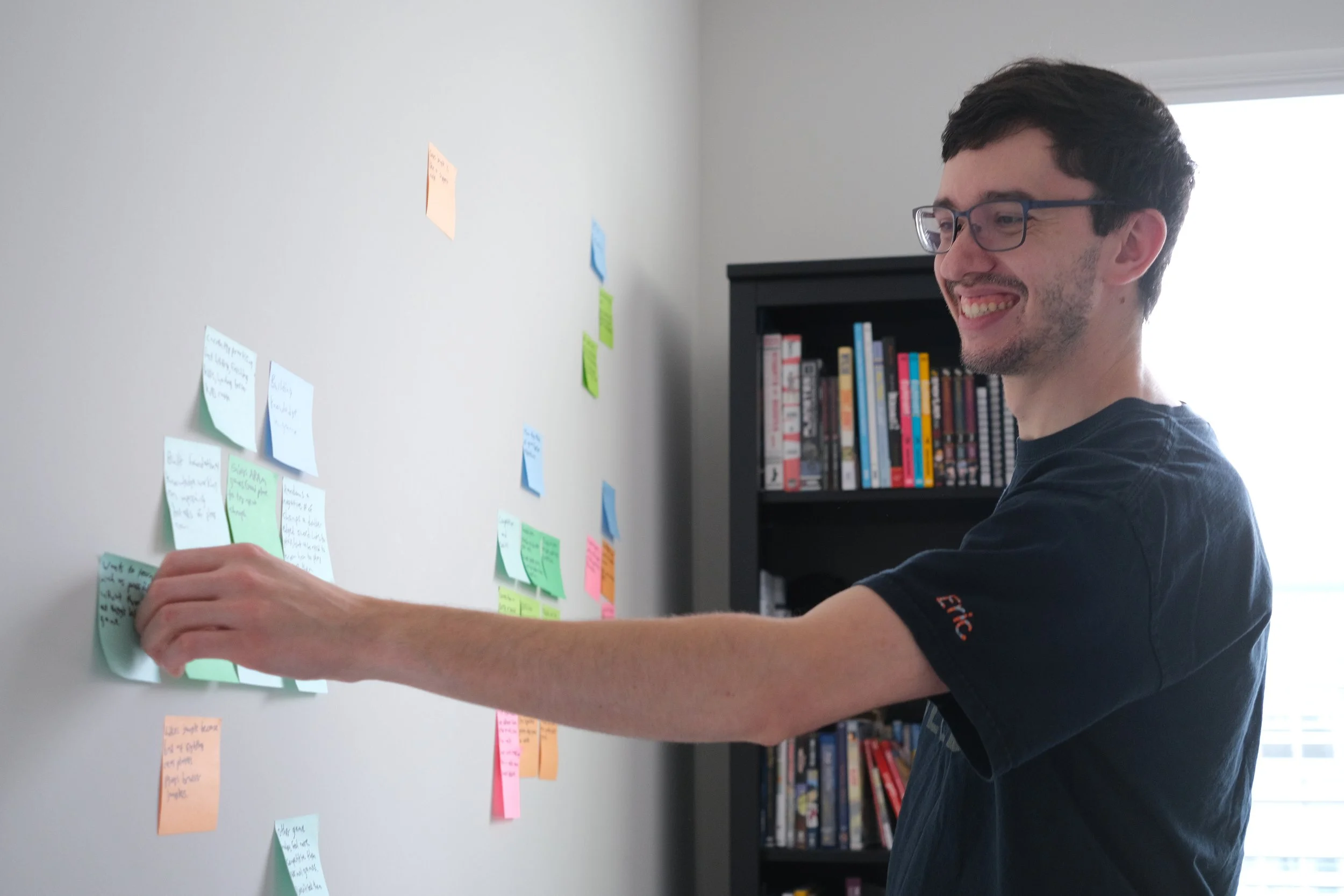
After conducting four interviews, I compiled my notes into an affinity map. A few themes started to emerge.
Three Key Insights:
Users want a supportive group of like-minded players to queue with
In-game resources don’t provide enough to learn the game
In-game tutorial isn’t relevant to actual gameplay
Self-improvement
Learning through YouTube
Learning in-game using ARAM, practice tool, or in unranked games
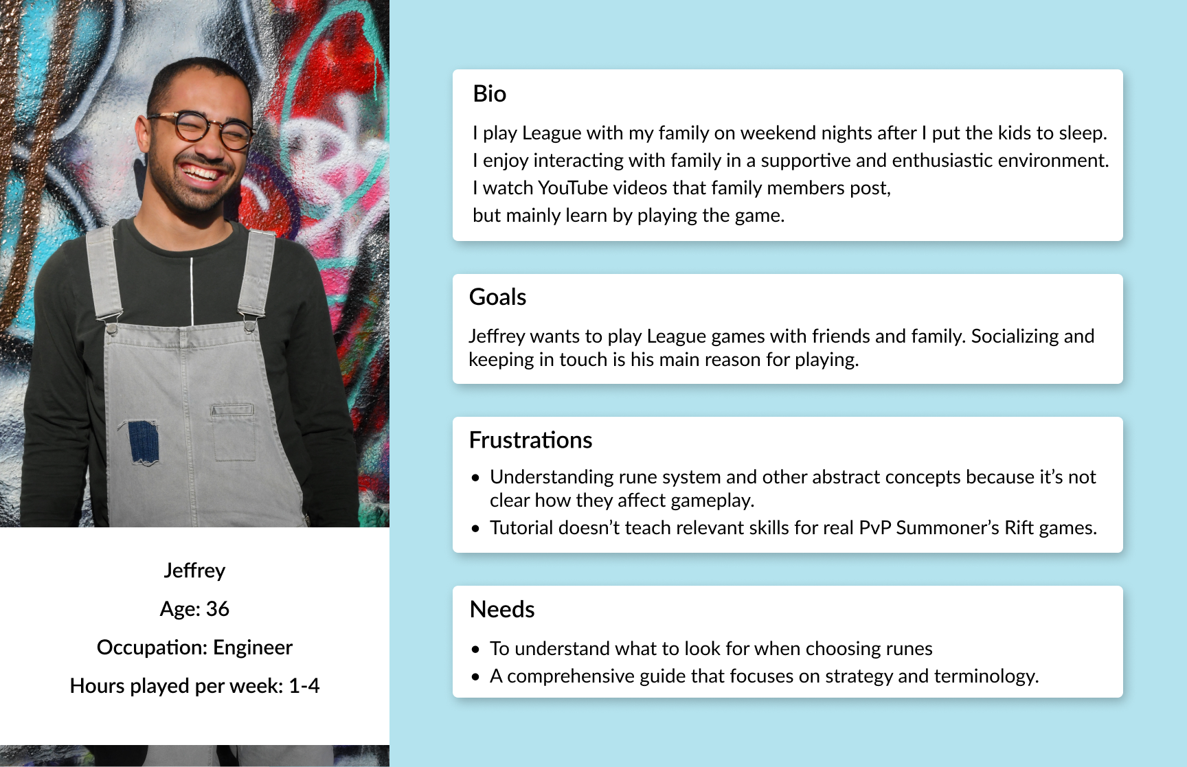
Jeffrey Has limited Time to Play But Still Wants to Learn
Beginner Players Don’t Use Current LoL Learning Platforms
Through my interviews, I learned that beginner players didn’t know how to use LoL learning platforms that threw lots of information at them.
I decided that I wanted my product to be more like Skillshare. I would now create a video learning platform that teaches beginner players the skills they need in the correct order with courses that build on each other.
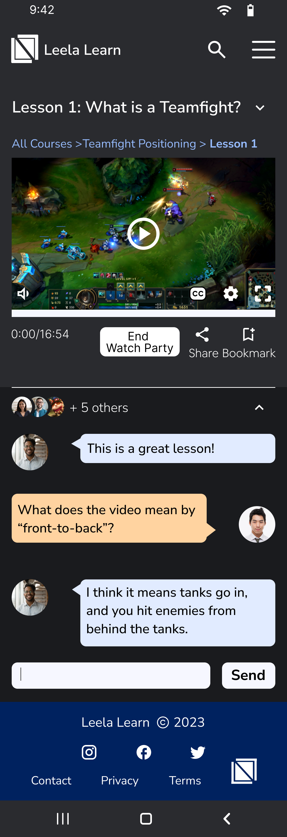
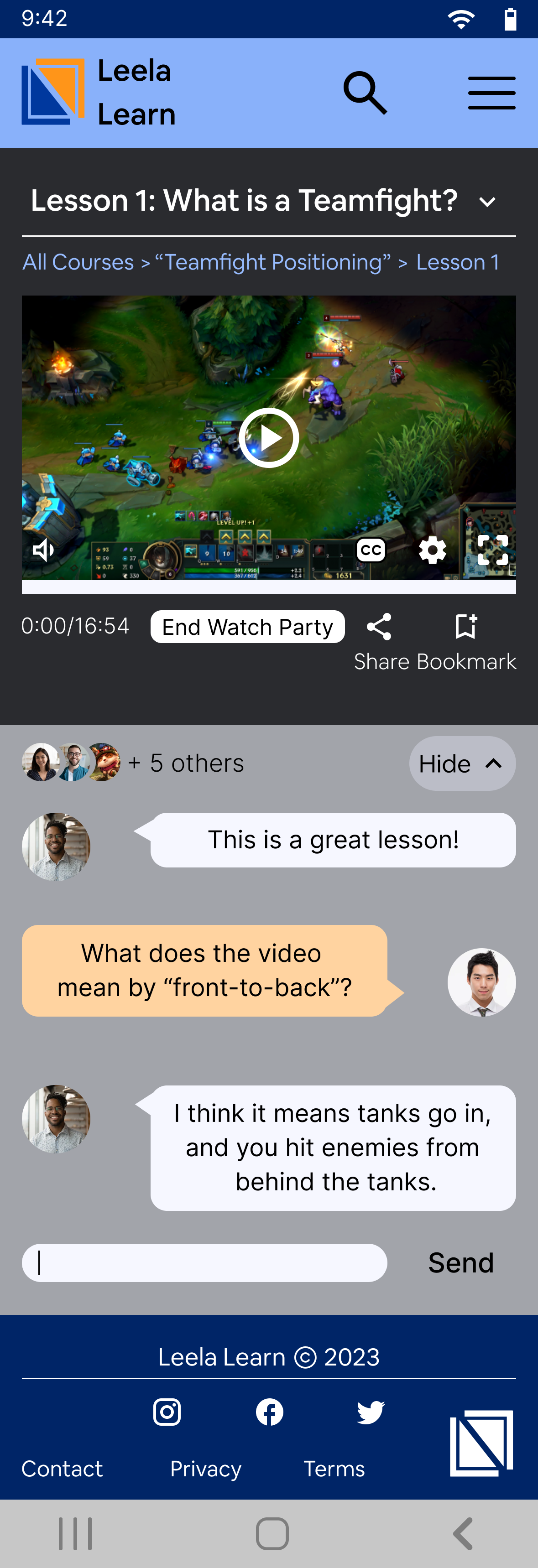
In addition, I added watch party and social features to address my interview insights about players wanting to experience the game with a group of people they know and are comfortable with.
Skillshare
Udemy
Which Features to Prioritize?
Must Have:
learning courses and associated features
Nice to Have:
Secondary features that enhance the experience, but are not required.
Quality of life video features such as “jump to” or timestamps.
Could Have:
Social features such as a learning group. So students can learn together.
Using Information Architecture to Create a Sitemap
During cardsorting, participants sorted items into 3 main categories:
Group Learning (social learning features)
Other Learning (learning elements that didn’t include a social aspect)
Courses (everything related to learning lessons)
I chose a nested menu because users had an easy time categorizing elements and I wanted to keep the flows simple.
How Will Users Navigate?
Watching a Lesson
Learning material is broken down by courses, and within that are the individual lessons. Users can bookmark their favorite lessons for easy access later.
Creating a Study Group
Based on card sorting, “study group” is grouped with group learning features. Users can easily add study sessions to the in-app calendar, as well as integrate it with their favorite calendar app.
Managing a Study Group
I envisioned users being a part of multiple study groups, because of this, I wanted users to be able to view existing groups, and create new ones from the same page.
Starting to Design
During interviews, several users mentioned wanting to use this on their phones while they play. I used this insight to create my product for mobile. I envisioned users using this app on their phones while being in a LoL game on desktop. This way, players could consult the learning resources without having to leave the game.
Once completed, seeing all the screens mocked up and laid out helped me notice any details that might be missing or unnecessary. One example was to have a drop down menu to go between lessons, instead of a “previous” and “next” button. This would allow users to jump to a lesson, instead of clicking through all the lessons one at a time. After each round of iterations, I would get critique from multiple sources (mentor, fellow students in group crit) and make more changes.
Study Group
The main page to create and join study groups
Group Learning
The hub for all social features.
Calendar
Schedule a study session or view an event.
Add an Event
Users can input all the info needed to add an event to the calendar.
Secondary Features
Hamburger Menu
An alternate way to access main site features.
I Want the Site to Feel Friendly and Exciting
Blue and orange color scheme to feel calm and grounded, but also have a bit of energy and excitement.
Chose “AirBnB Cereal App” because it feels friendly while still being professional.
Adding Personality
Now that the aesthetic was locked down, it was time to flesh out my screens.
Added an image behind the login screen to immediately immerse the user.
Added breadcrumbs for more ways to go back and forth between screens.
Applied blue and orange color scheme. Blue is the main color, with pops of orange throughout to add energy.
Testing My Designs
For my initial usability test, I had 4 participants.
Here’s what I wanted to test:
How easily can participants navigate the interface and complete tasks?
Are there any sections that the participants have trouble navigating/interacting with?
Are there any features missing that participants think would improve the experience?
“I really liked the transcript… because sometimes I feel like when I’m watching videos... I would have a hard time hearing.”
“Oh bookmark! That’s pretty cool!”
“My first thought was to go in the hamburger menu, and there it is!”

Takeaways and Updates
3 of 4 primarily used hamburger menu to perform tasks. (The last one searched the homepage first before using the hamburger menu.)
None used the search bar without being prompted.
1 requested multiple ways to access each feature.
3 were confused about if “create event” would be under calendar. They expected it to be visible in hamburger menu.
Most clicked around on every button as if it were a real site.
This points to the design being immersive and usable.

Homepage
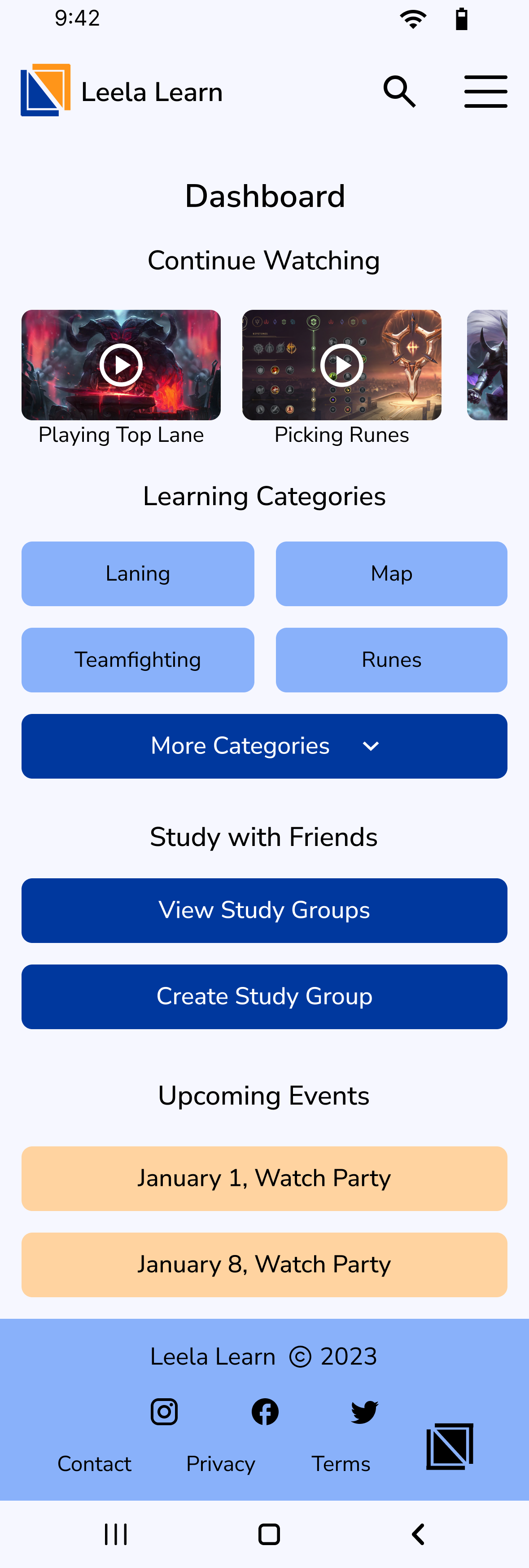
Participants were confused when trying to access group study features since they weren’t visible on the home page. To solve this, I added a dashboard page that is visible after users login.
Based on critique, I updated colors and design elements to have less clutter.
Users were overwhelmed by the amount of elements on the log in page, so I removed the user testimonies section.
Old
New
Old
New
Courses/Categories Page
I learned that this courses page wasn’t needed.
Courses split up by category already had their own page.
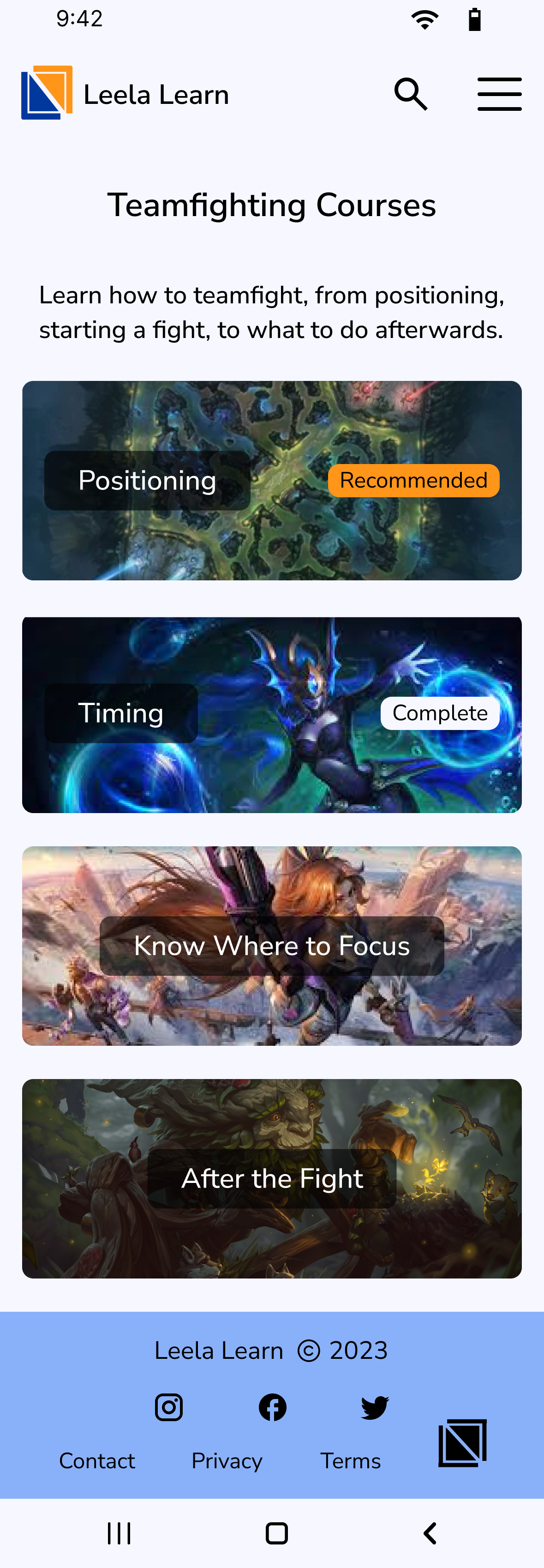
I changed this page to be the main categories, to quickly drill down to the course and lesson the user wants.
I also cleaned up the visual look to have less competing areas of color that distracted from the cards.
Recruiting Additional Participants to Test Changes
After hearing similar insights from round one of testing, I recruited additional participants to test the changes I made.
Here’s what I learned:
“Start learning” title wasn’t clear to users about if the button will take them to a course or a lesson.
Having the categories buttons be images negatively impacted usability.
A more subtle button at the top of the page works for usability while also falling into the visual hierarchy.
The Finished Product
Logged-in Dashboard
Has group study features prominently displayed to promote users utilizing them.
Categories
First three categories are shown (with the option to expand and see more) so as to not overwhelm users looking to learn a specific topic.
Lesson
Research participants mentioned not always being able to watch videos with the sound on. I added captions and a transcript to increase usability.

Reflection
It’s important to deeply understand users.
From my interviews, beginner players indicated that they prefer to play in a group of friends of family. Because of this I pivoted my product to be a Skillshare-type platform instead of creating a traditional site with build guides and counter matchups, but for beginners.
Always look for feedback.
There were multiple times through the process that critique I received in group critique sessions improved and kept my designs on-track. As mentioned above in the wireframing section, the header I originally designed was confusing and cluttered, but after getting advice from my peers, I was able to simplify it to one that emphasized the search bar while moving the account button to the hamburger menu.
What Would I Do Differently?
If I were to do this project again, I would focus on reducing the amount of similar features.
I designed multiple ways to address the core issue (watch parties, study groups, calendar). Problem is, each of these features had a bit of overlap and muddied the waters for how the user was supposed to learn LoL with friends. If I would’ve chosen one feature, my end product would’ve felt more streamlined.


