


Midnight Stop Stationery
An online stationery shop created in collaboration with a stakeholder.
Role: UI/UX Designer, Researcher
Client: Midnight Stop Stationery
Summary
I have always been interested in how online businesses work and what goes into designing a good shopping experience. The opportunity arose work with a small business owner, and I jumped at the opportunity. In addition to learning how to design an e-commerce site, I could also gain valuable experience working with a client on a project with an immediate impact.
Why Small Business?
Through a mix of interviews, talking to the client, and user testing, I learned about what users like and dislike when shopping online.
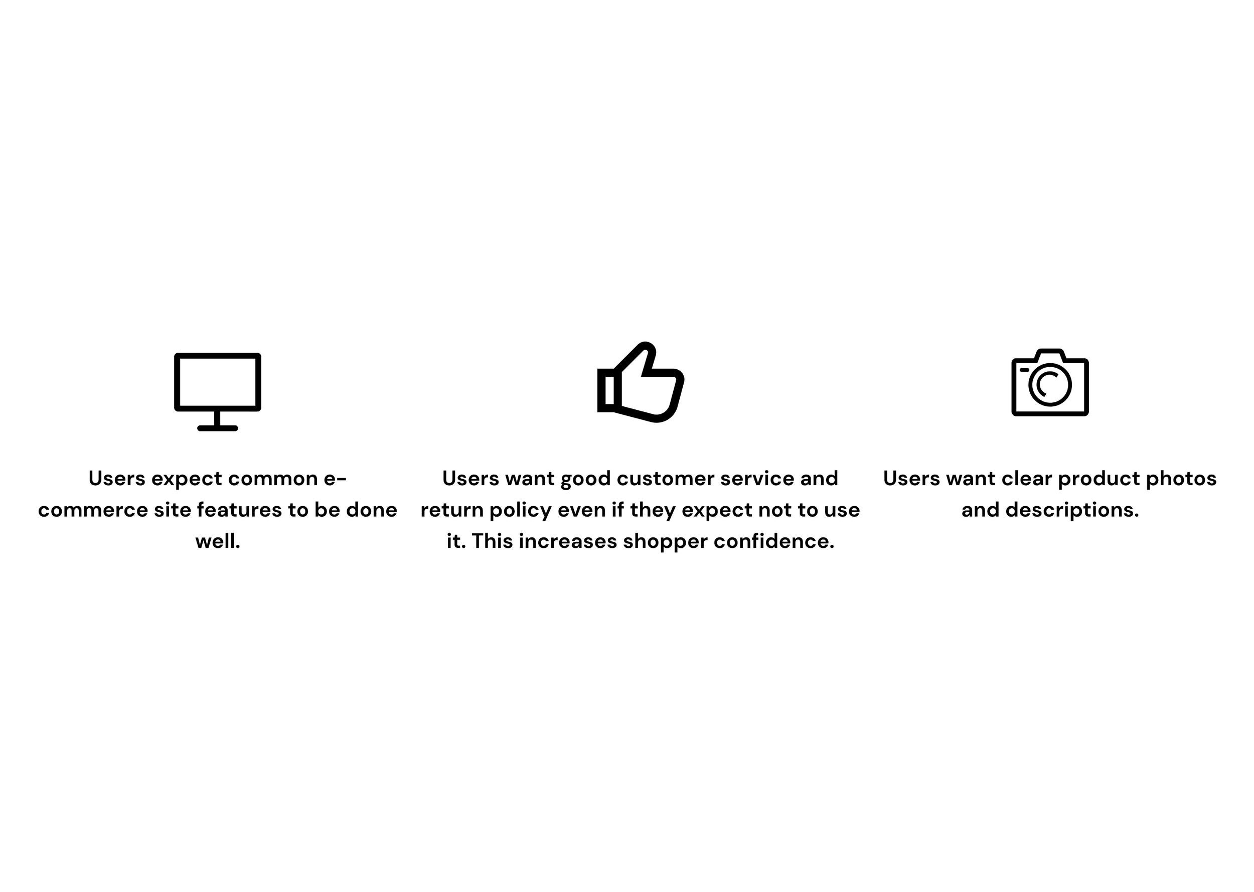
Users expect a good tagging system in order to search with filters. They also expect good product groupings, a descriptive product image and text description that isn’t distracting. Basically anything that helps users quickly gauge the quality of the products and easily purchase them. This helps the business goal by making the experience enjoyable without being intrusive. Any hang up could mean the difference between a returning customer and a lost sale opportunity.
How Did I Conduct Research?
There will always be more to add. Throughout the process, I found myself constantly tweaking and adding to the design. While this led to a polished final product, I noticed that I spent lots of time perfecting areas that I thought would be important, only for usability testing participants to ignore those features entirely. This full-polish approach delayed my final delivery date.
Key Learnings
My job is to understand the business goals and find the best way to deliver on them with the user experience. Being my first time working with a client, I didn’t fully know what to expect. Once I learned about their business goals and brand theme, I realized that these constraints helped my design process.
Understanding the Client
I had the opportunity to collaborate with a client who was seeking website design services for their upcoming online stationery business. From the beginning, they recognized the crucial role that a well-designed website plays in establishing a strong online presence and attracting customers.
With a clear vision in mind, the client expressed their desire to create a website that not only showcased their products effectively, but also clearly reflected the brand identity. This is what I set out to create.
Why is a Website Important?
Besides being a central hub to sell products and market to customers, it also provides data about consumer habits.
The client wanted a multi-pronged approach utilizing social media as well as a website. Social media would attract potential customers, and website would sell products and further promote the brand.

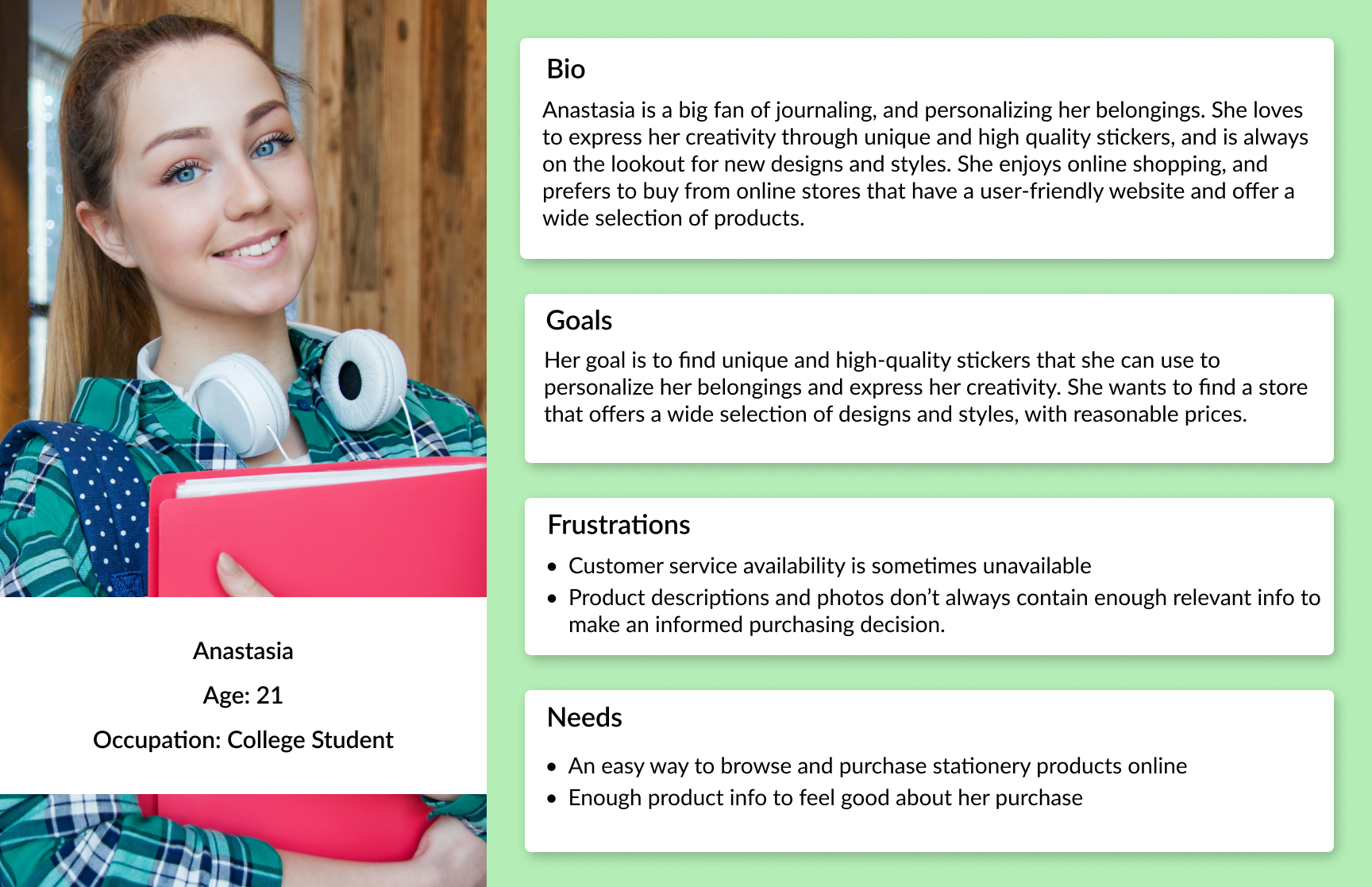
How might we help “Midnight Stop Stationary” customers easily purchase products and keep up with the brand?

Time to Learn What Online Shoppers Want
Now it was time to interview online shoppers and see what they said about current online learning offerings.
I wanted to learn what features users prioritized in their online shopping experience and why they preferred some features over others.
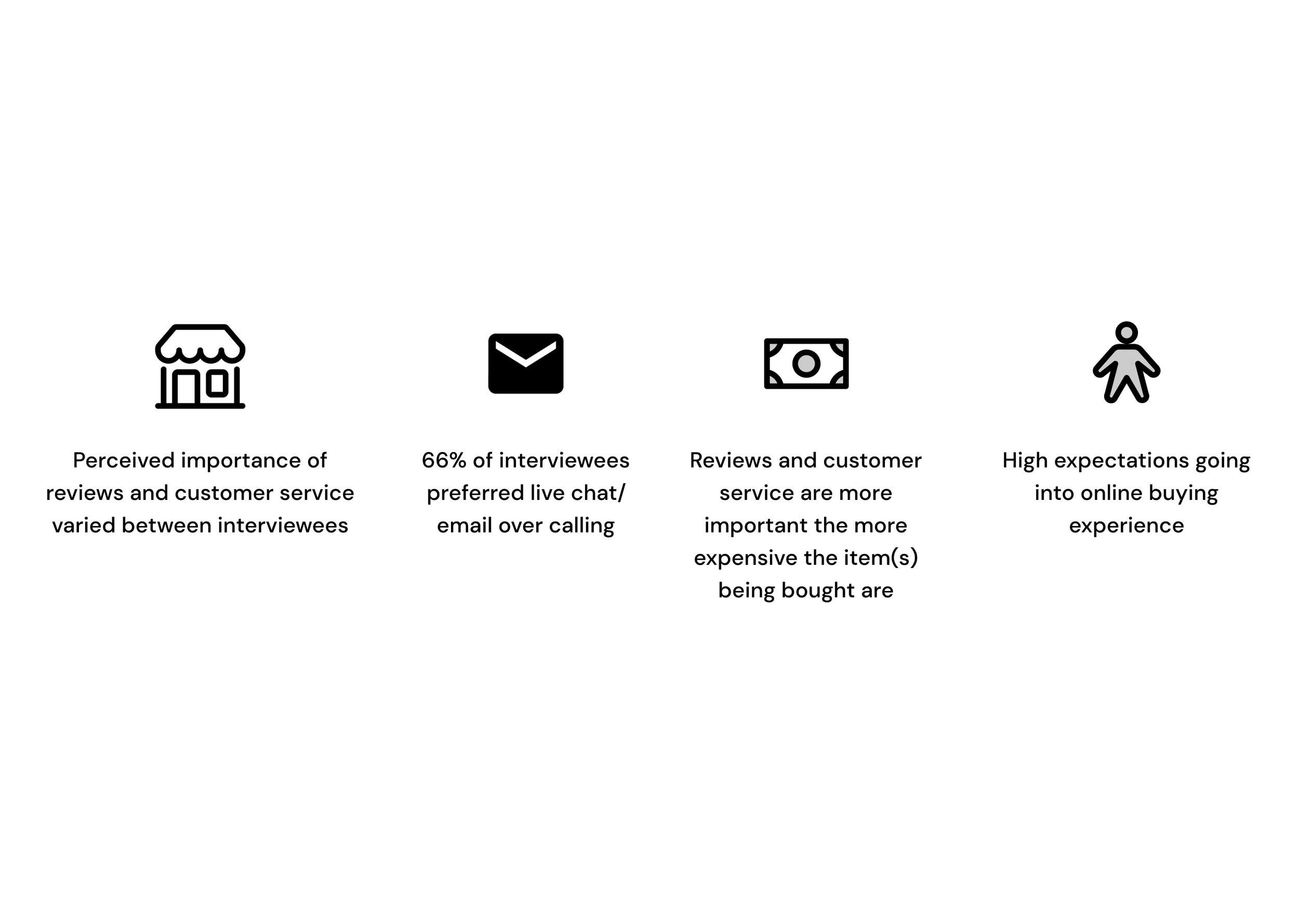
Lots of expectations going into online buying experience:
Good tags (so items can be quickly and accurately searched)
Listings grouped by product (best-selling, and seasonal on home page)
Product description with sizing, process in it
A hero image that describes the shop and is legible
Easy to find reviews, prices, product info
Descriptive product photos (have item a good size in photos. Not too small.)
Contact info
Online Shoppers Expect a Lot
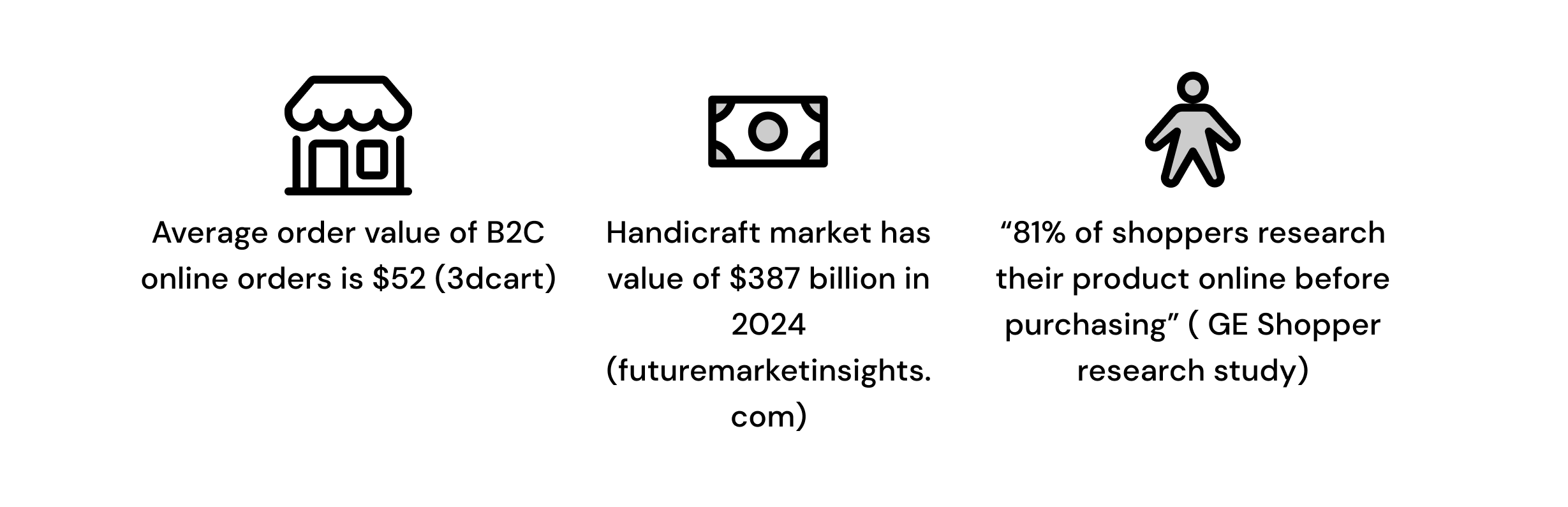
I interviewed 6 online shoppers, with an emphasis on those who buy handmade goods.
The Site Should Stand out From Competitors, but Not Inconvenience the User
After conducting 5 interviews, I compiled my notes into an affinity map. Here’s what I found:
Anastasia Wants to Buy Quality Stickers For Her Hobbies
How Will We Showcase Products?
After looking at competitor sites, I discovered that product categorization is most important.
Users will visit other online shopping platforms more than they will this one.
Because of this, they have expectations for how products should generally be organized. The site should conform to those expectations.
This means that products should be prominently displayed on the homepage as well as
I knew from interviews that getting the mental model correct would be important.
I organized pages by product as opposed to by collection (summer collection, winter collection, etc.)
This helps users see every type of item in a category all at once and compare products. For example, viewing all shirts, or all stickers.
Adding a blog feature.
To differentiate this site from competitors, client wanted a blog. This way they could show their personality and grow their brand.
Ended up not including it in the final product because the client was just starting their business and didn’t have content ready to post.
Wanted to include it in the site map as a guide for the client when they eventually did have content to post on a blog.
Also, nailing the shopping experience was top priority, and I wanted to focus my efforts on the shopping experience before adding other bells and whistles.
Avoiding Information Overload
I started sketching out different layouts based on improvements I noticed could be made form competitor sites. I wanted to make sure shop items were easily findable, but that each page didn’t have an overwhelming amount of images of pictures.

Creating the Bones of the Site
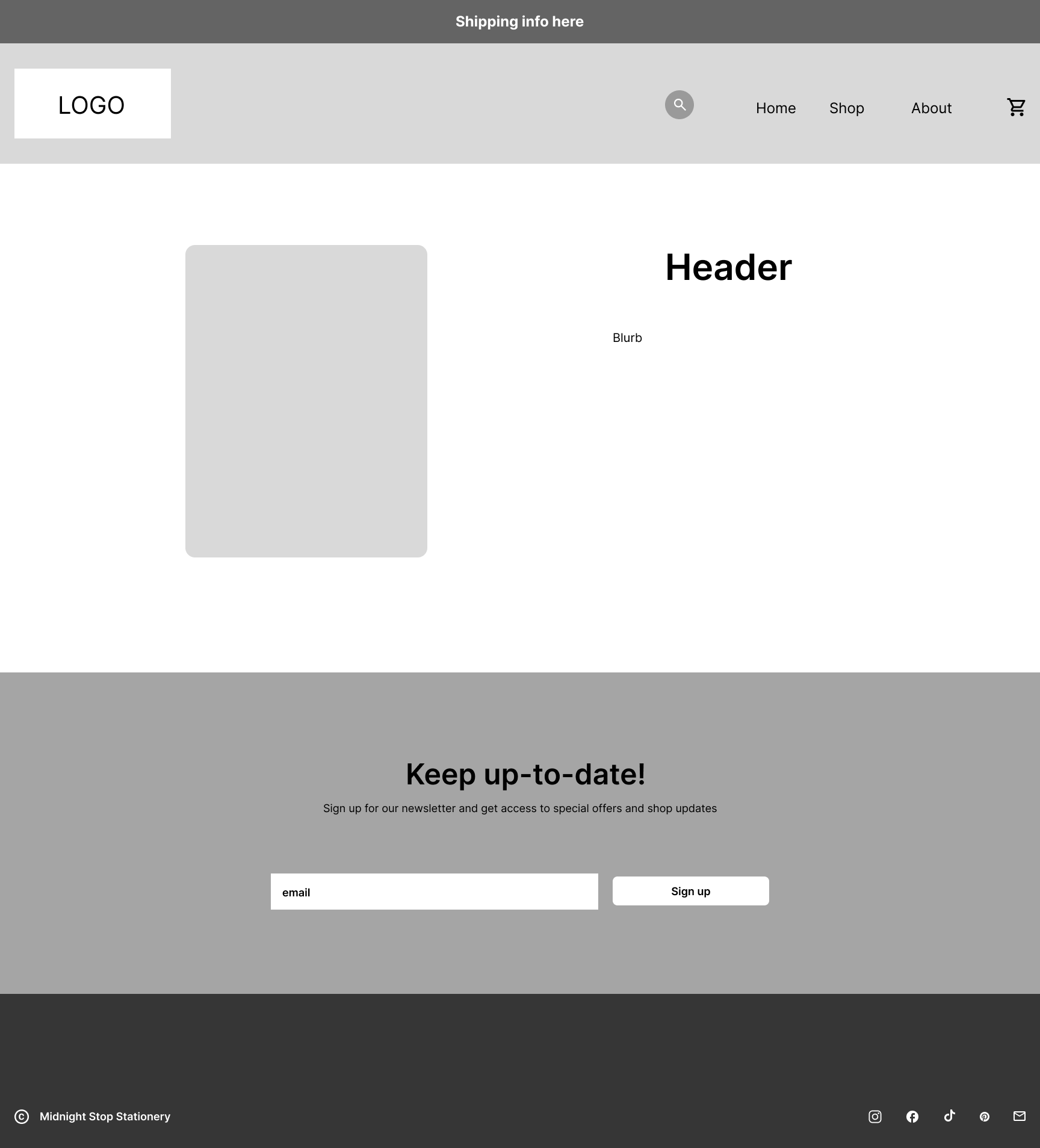
Home
This is the first chance to hook users in to the brand and world that the client has created with their products. Having a prominent hero image was essential.
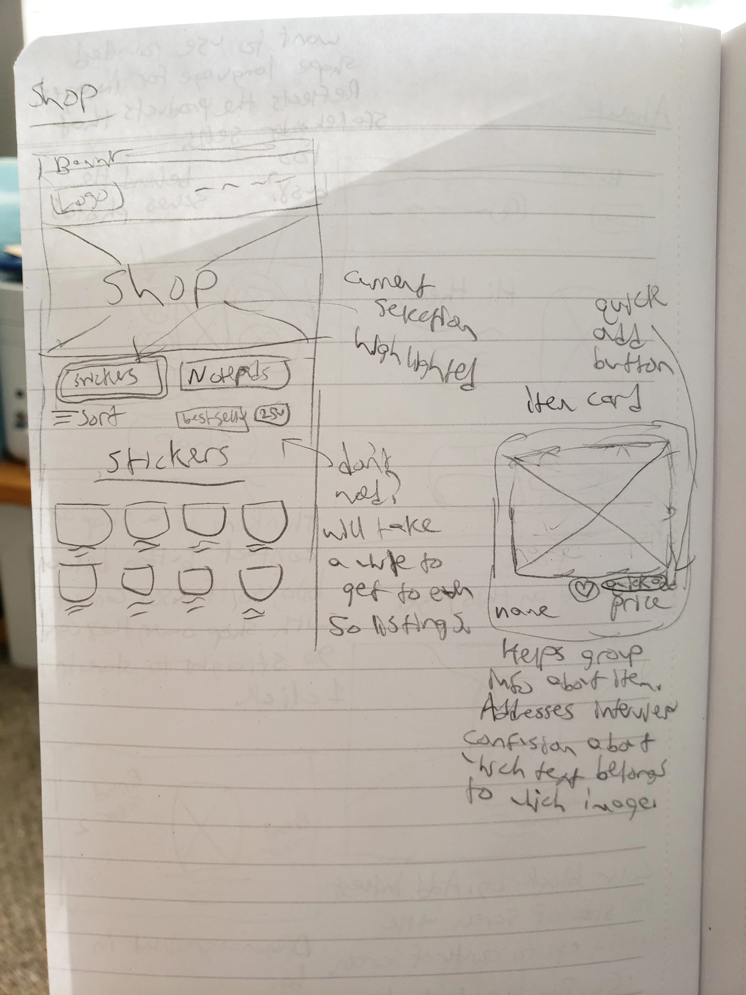
Stickers Shop
Shop pages are organized by product type, with the ability to filter results.
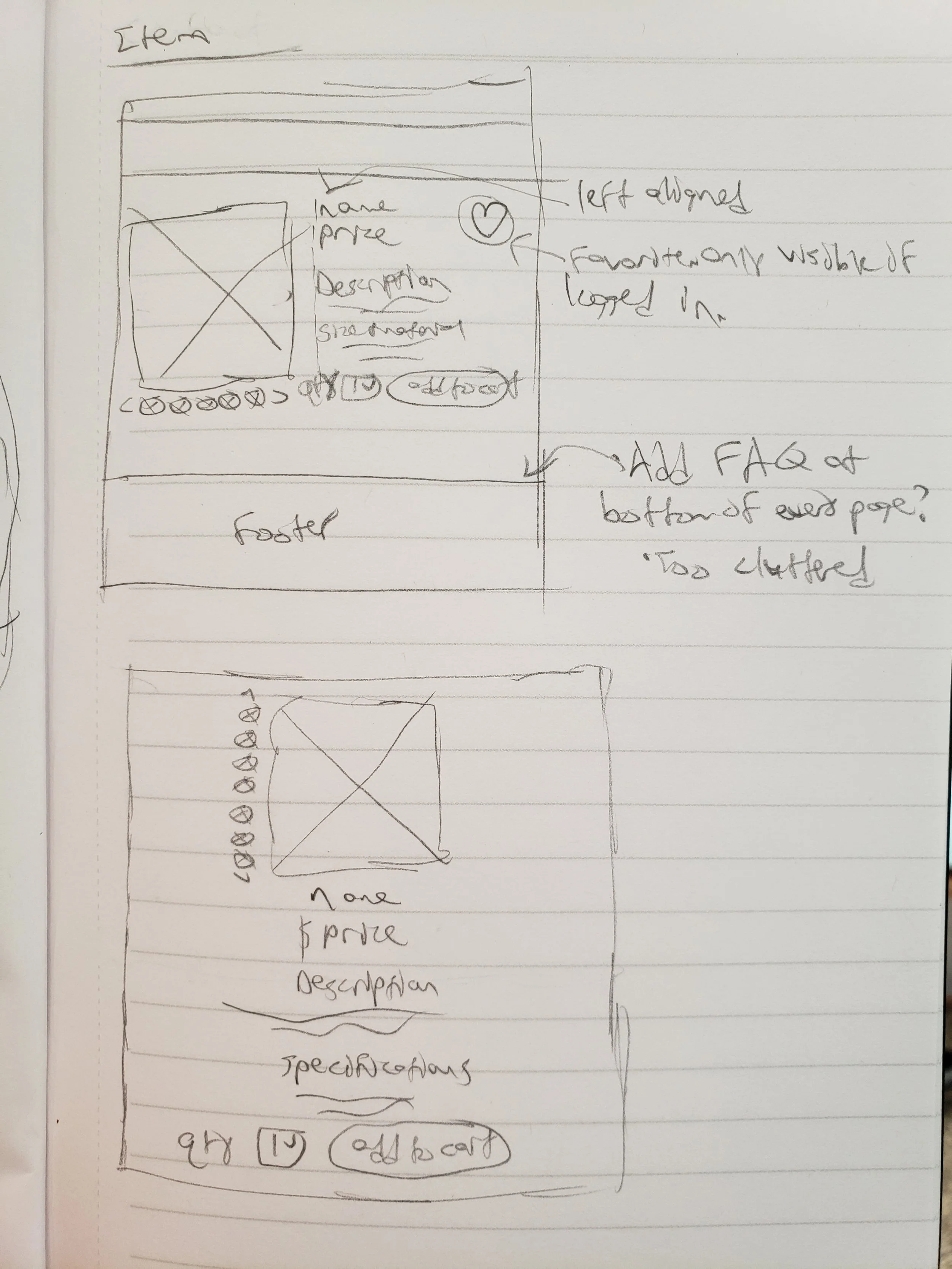
Product Description
Everything on this page is designed to offer as much information to shoppers to hopefully encourage purchasing the product at the top of the page.
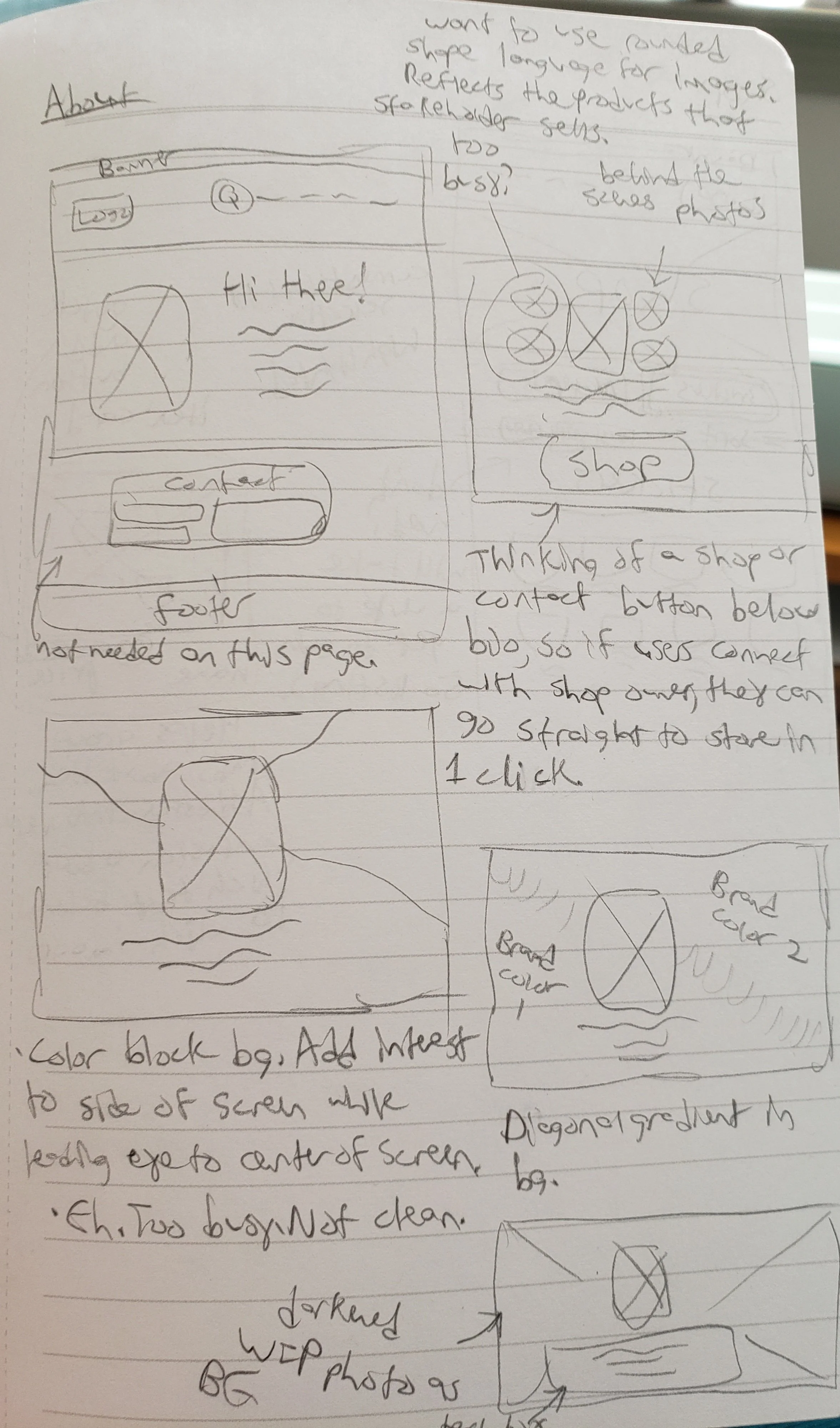
About
The client’s image and story goes here. Helps users relate to the shop owner and learn about their story. Since storytelling is important to brand loyalty, this page is a must-have.
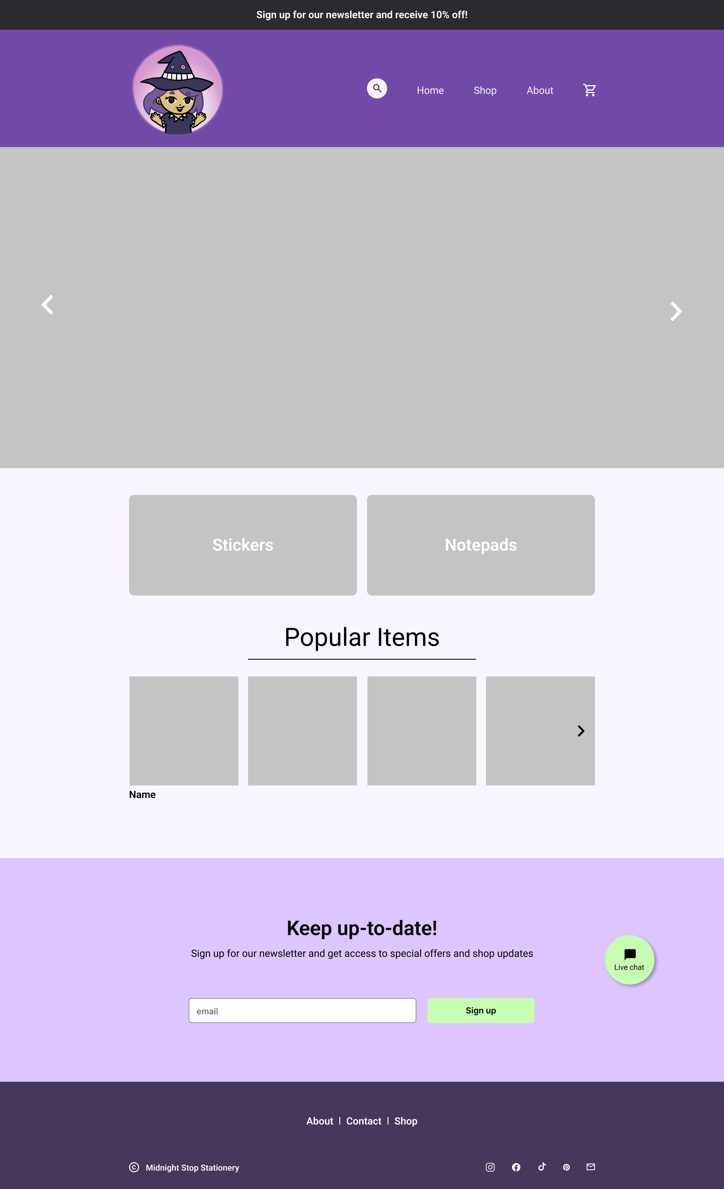
Conveying Brand Identity
After consulting the client, we decided to use colors from their logo. (Purple, green, pink).
Purple implies luxury
Pink adds playfullness
Green is associated with nature and ties in with the client’s products
Chose Roboto for the font.
Wanted the site to feel modern but also playful.
Translating Brand Identity to Mid-Fidelity
I noticed that the colors didn’t fit the client’s needs, so I pivoted to a darker more simplified color palette.
Back to the Drawingboard: Simpler is Better
To have a more moody theme, I simplified the color scheme to purple with dashes of green.
To reduce eye fatigue, I lowered the saturation of the light and medium purple and significantly lightened up the light purple as well.
Testing My Designs
I had 4 participants. All were avid online shoppers whose ages varied from young adults to senior citizens.
Since online shopping isn’t contained to just one age group, I wanted to keep accessibility top-of-mind.
My Task Flows:
Choosing and buying a die cut sticker from start to finish
Add an item to “saved” list, then adding it to their cart.
Here’s what I wanted to test:
How easily can participants navigate the interface and complete tasks?
Are there any sections that the participants have trouble navigating/interacting with?
Are there any features that participants want, or any that they completely ignore?
“I like how I can see the different options, and right away have a sense of the price...” - Participant 3

“It followed the same type of pattern and flow that I would expect, just from my experience ordering other things online.” - Participant 6

Takeaways and Updates
75% of participants used the search bar without browsing the main page when completing Task Flow 1 (find a specific item to buy and go through the process of purchasing it).
100% of participants had issues navigating the checkout flow.
This points to site layout and usability being correct, but details about text fields needing more refinement, such as the ability to go back and edit a field.
100% of participants wanted a “save” button on the product photo to click on, instead of a text button near the item description.
“Show, don’t tell”.

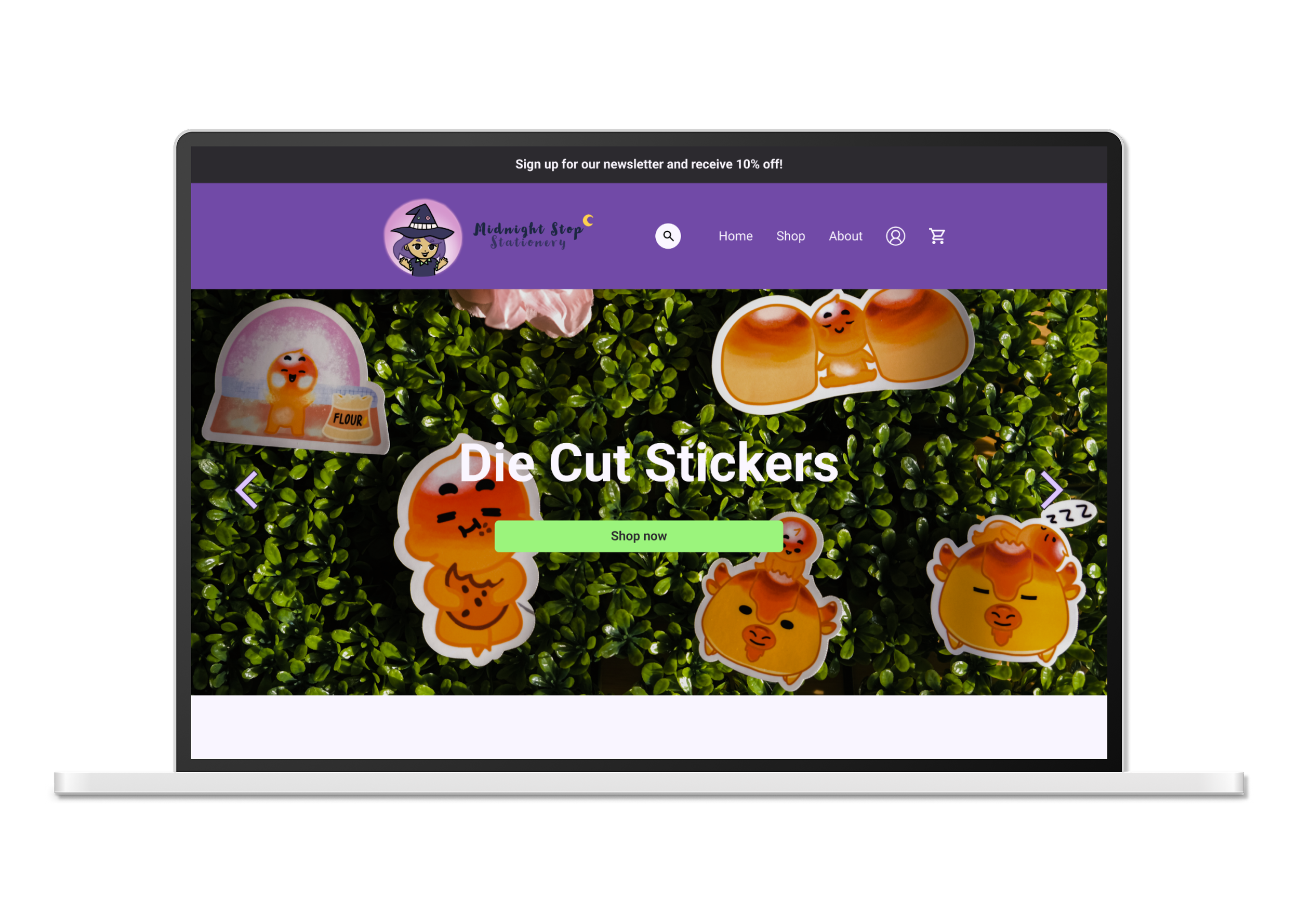
The Final Screens: Brand Identity, Usability, and Appeal
Products are the focal point of each page they’re on.
All important information is easily visible, and secondary information only takes one additional click (“account” and “shop” dropdowns in main menu).
Brand colors used to create strong brand identity and also give a nighttime vibe in-step with “Midnight Stop Stationery” name.
Home
Users can browse the main product categories and have multiple areas to click if they want to explore more. Features collections are visible in the hero image section.
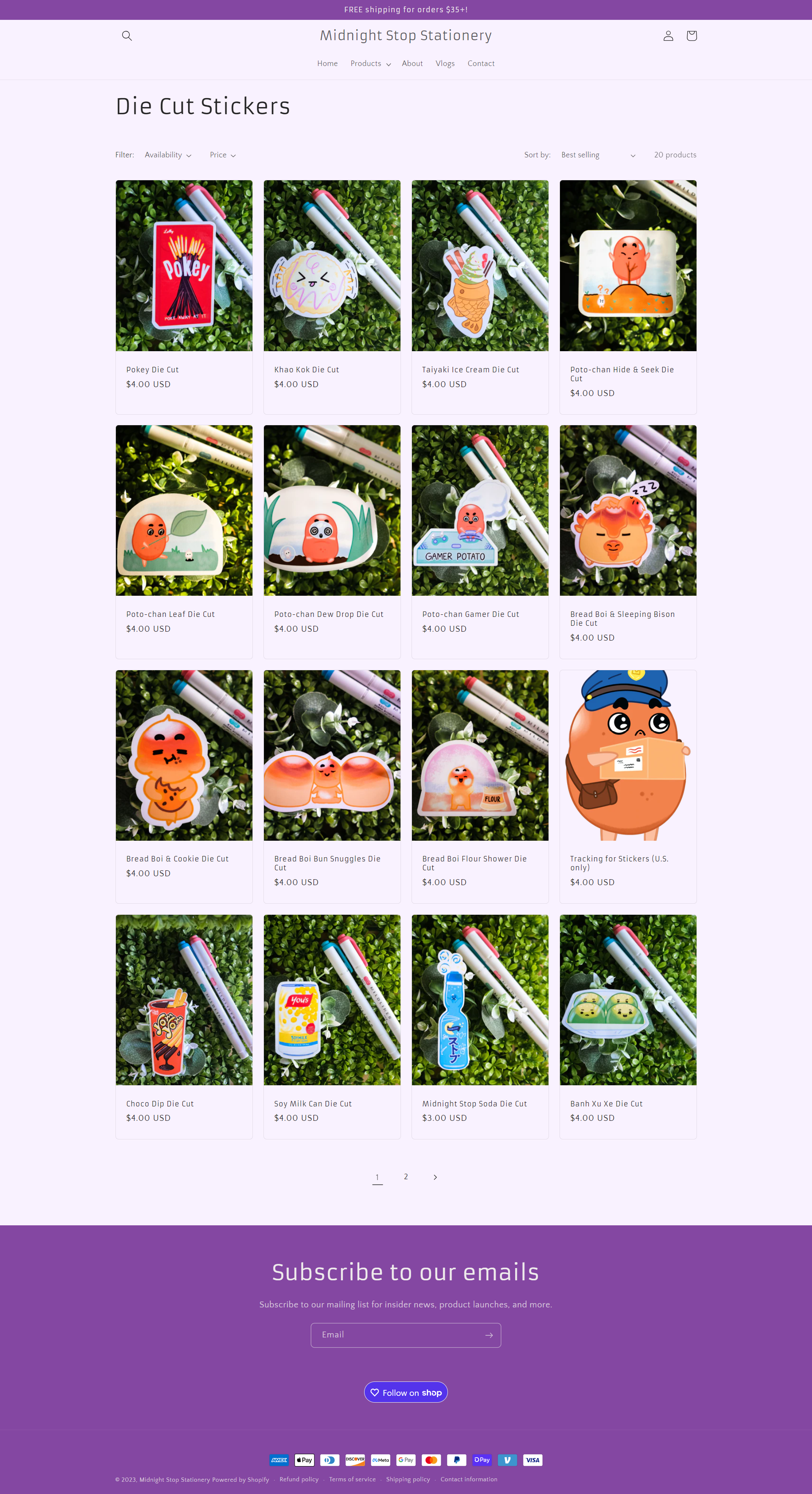
Stickers
This is where users can see every item in a specific category. Since the only items offered are stickers or notepads, there is a radio button to switch between the two product categories.
Item
All info needed for the user to make an informed purchasing decision is included on this page. During competitive analysis, I found that the FAQ section was always placed above product reviews. This way users can have their questions answered easier, and hopefully increase the likelihood of purchasing.
Checkout
The checkout flow is split up into a couple screens so that the task of inputting and confirming info is split up into bite-sized chunks. Increasing their likelihood of completing the purchase.
Explore the Prototype
Translating the Designs to Shopify
When recreating the designs in Shopify, not much was dropped from the original designs. The Shopify version retains the same look and feel that the Figma designs have.
The home screen is the only area that drastically differs between the prototype and Shopify page. This is because the client wanted to focus on bestselling items. They thought it would overwhelm shoppers if too many products were showcased at once. To keep item categories accessible, I suggested they add a dropdown in their top menu to search by item category.
Figma
Shopify

How Has This Helped Me Grow?
There will always be more to add.
Throughout the process, I found myself constantly tweaking and adding to the design. While this led to a polished final product, I noticed that I spent lots of time polishing areas that I thought would be important, only for usability testing participants to ignore those features entirely. This full-polish approach delayed my final delivery date.
The client had a hard deadline for their shop launch, and I was unable to meet that fulfillment date. To remedy this, I gave the client my wireframes and style tile for them to use to get their site created before their shop launch. A few days after the shop launch, I finished the screens and, we updated the site to be in-line with the final designs.
Moving forward, I plan to take a more balanced approach. I will conduct testing early and often to see which areas of a product I should be spending the most time on, in order to deliver projects on time and on budget.


My job is to understand the business goals and find the best way to deliver on them with the user experience.
Being my first time working with a client, I didn’t fully know what to expect. Once I learned about their business goals and brand theme, I realized that these constraints helped my design process. Anything I added would need to have good clarity while also being on-brand.
What Would I Do Differently?
If I were to do this project again, I would conduct more usability testing focusing just on the checkout flow.
This is where users got the most tripped up while trying to fill in forms. Even though a user might be enticed enough to start trying to buy an item, the sale isn’t complete until they complete the process, and if any of the steps are cumbersome, that might lose the sale.