


Role: UI/UX Designer, Researcher
Summary
Why Do Small Business Owners Need Marketing Tools?
I know a lot of small business owners (both online and brick-and-mortar). Some of them have complained about their marketing material not being seen, or not wanting to make the marketing material themselves. I saw an opportunity to help them in a more focused way than current market offerings by incorporating AI.
How Did I Conduct Research?
I conducted a competitive analysis of current marketing platforms (some that incorporate AI, and some that don’t)
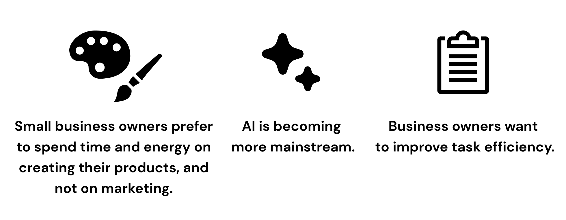
Through interviews, I learned that small business owners prefer to spend time and energy on creating products and not marketing. In addition, they want to improve task efficiency. I hypothesized that there was room for AI to help small business owners with their marketing.
Key Learnings
Step out of your comfort zone. I wasn’t too familiar with AI or its uses. Once I decided to incorporate AI elements into my product, I embraced the design challenge. I’m glad the I used the opportunity to push myself and learn about a technology that is becoming ever more important.
Be mindful of scope creep. I initially wanted to include 5-6 features. But after advice from my peers, I narrowed down the feature set. This helped during the prototyping process when I had to create more screens than anticipated for my main feature. After running behind schedule in my previous project, I wanted to avoid this at all costs. So this time, I prioritized features by impact vs effort.
Background
Small business owners have a lot of tools to help run their businesses, but without years of experience, or a business background, they might not know how to use those tools, particularly in marketing. With the advent of generative AI, some tasks have now become more accessible.

How might we make marketing less stressful for small business owners, and more engaging for potential customers?
Competitive Analysis: What Goes Into a Promo Image Platform?
I knew that tools for small business owners already existed. What I wanted to see was if there was a gap in the industry around marketing specifically. I hypothesize that small business owners want a more seamless way to create and post marketing material so that they can get back to running their restaurant or creating items for their online shop.
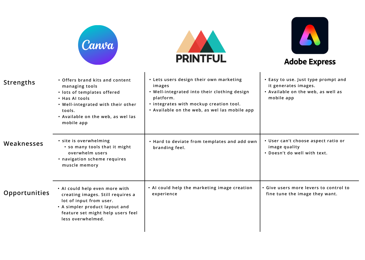
Now that I found areas of improvement compared to competitors, it was time to interview small business owners and see what they said about online marketing and AI.
Conducted interviews with 7 participants: 5 small business owners, 2 who buy from small businesses often.
Research Goal:
I want to know what small business owners need in order to more effectively create marketing material.
What I Learned From Interviews and Affinity Mapping
Research Findings
Small business owners know what they want.
Money is time. If a repetitive task can be simplified, then users want to use that freed up time on their products.
I want my product to take the hassle out of marketing while also making the process faster.
With AI becoming a household term, there is room to incorporate it into a product that simplifies marketing.
There are multiple avenues to take when incorporating AI, but i hypothesize that generative AI would be the most helpful for users.
Users know that good marketing is important.
Because of this, I knew that whatever I designed had to incorporate good marketing fundamentals in order to generate engaging content.
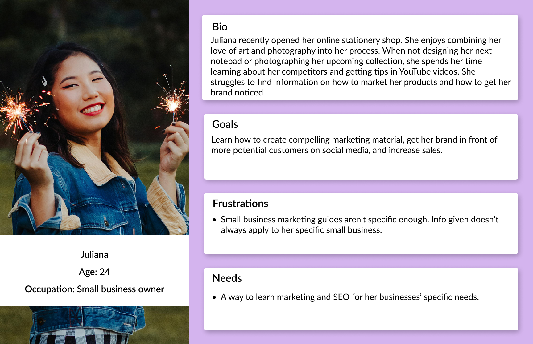
Juliana Wants to Learn How to Market Her Brand
Must Have:
I envision the core feature of this product being the AI image generator.
For small businesses, having to manually find templates and adjust them to the brand style and input the brand text takes a lot of time. This is why the marketing image generator tool is a must-have feature.
Other AI-related features would increase utility.
Nice to Have:
In this context, AI has the potential to greatly help users. Helping them create images that they either don’t have time to design, or aren’t able to attractively design themselves.
Could Have:
Features that add extra functionality to the generated image would help users know how their images perform online.
Which Features Compliment AI?
Going into feature prioritization, I knew it was important to pick complementary secondary features to fill out the app.
Organizing Features
Went for a simple menu layout.
Based on interviews, I grouped features by video tools, image tools, and learning guides.
Main features are accessible 3 ways: Home page, hamburger menu, search bar.
I wanted the main features to be accessible from multiple avenues.
Avoiding Scope Creep
I created 4 task flows, but after receiving critique, will only design 2 of them.
Main feature: “generate marketing image” flow.
“post analytics” second flow because it directly relates to the image the user creates in flow 1.
The other features are nice, but are secondary to the main feature.
A/B testing is high effort, and low impact.
Short form content idea generator distracts from the main purpose of the product.
Designing My Key Screens
Home
Imagined having a homepage with cards advertising the features.
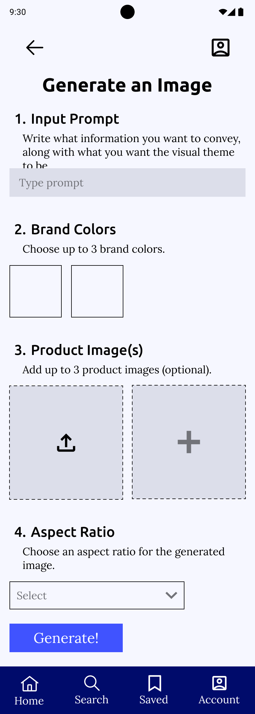
Generate Image
“generate” flow is one page so user could scroll up and down to review their inputs before generating image.
Analytics
After pasting a URL, user can view analytics for their social media post.
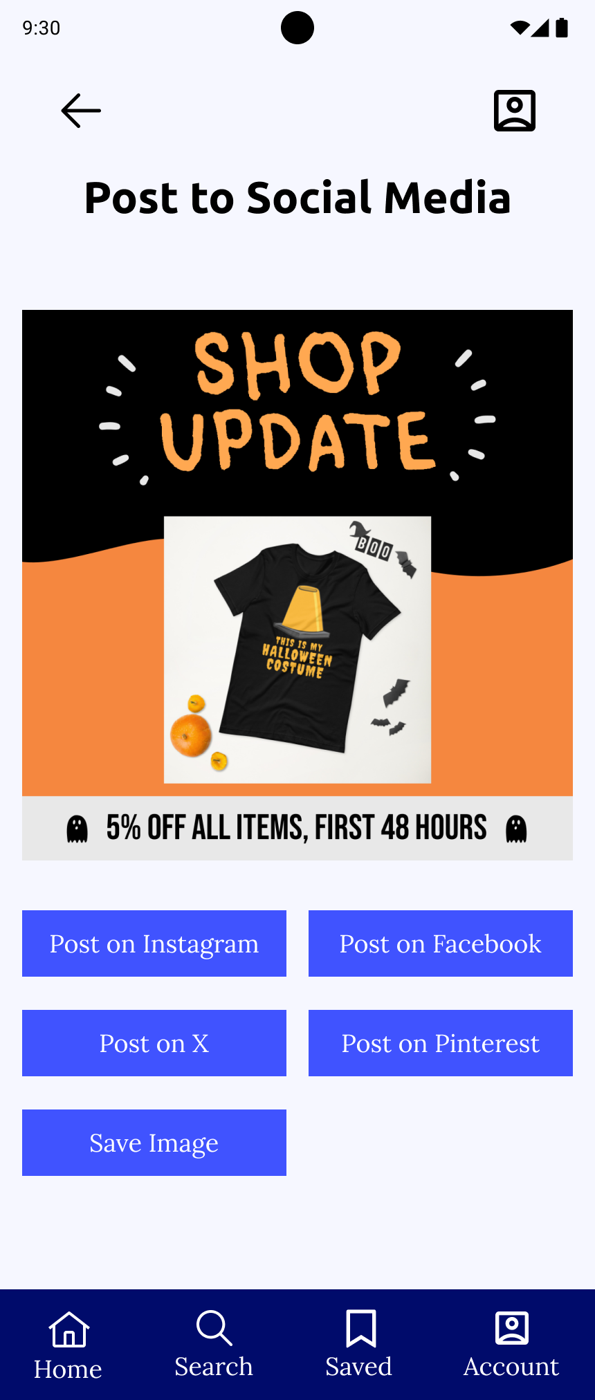
“Image Generated”
User can choose which image to use.
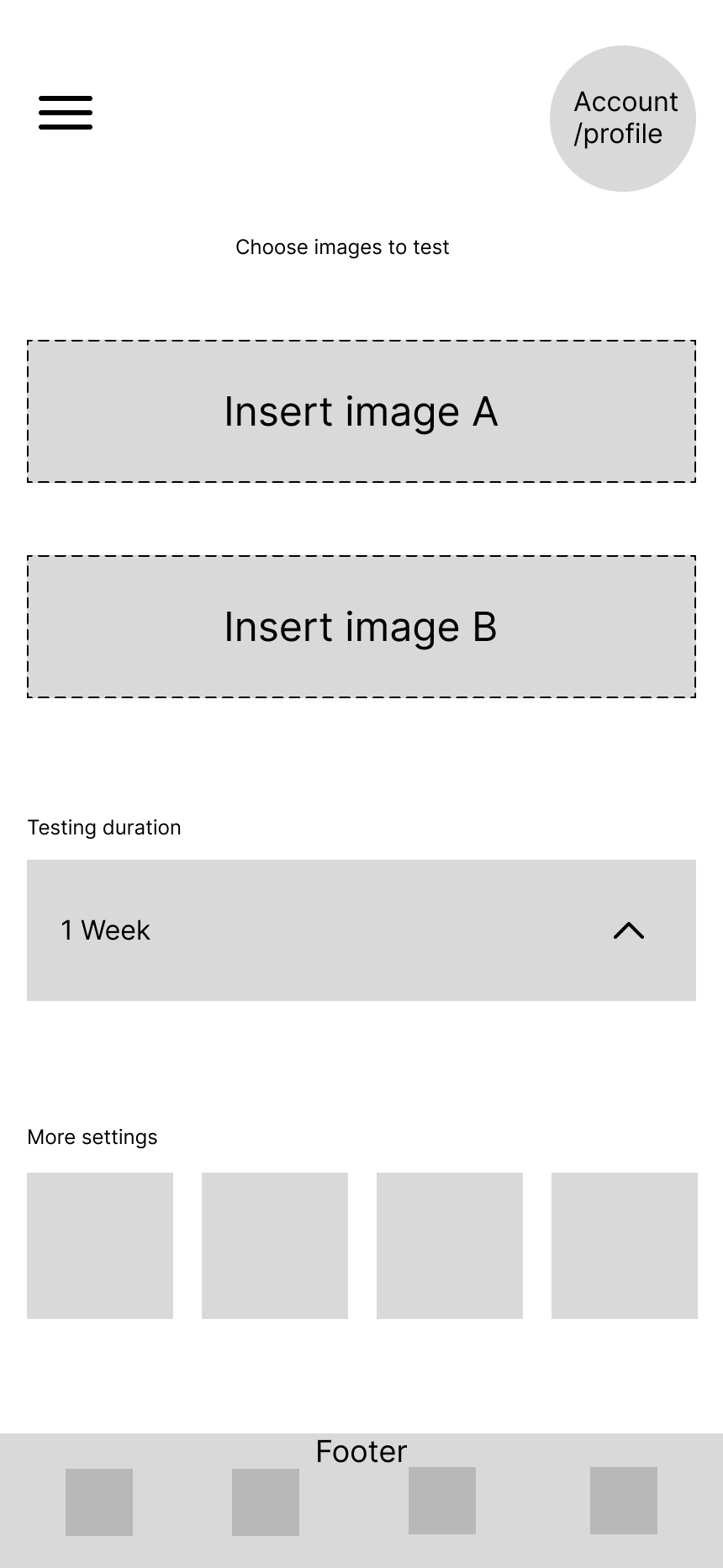
A/B Testing
Envisioned being able to compare created marketing images before user posts them. Cut this feature. High effort, low impact.
Setting the Stage
Researched competitor AI products and noticed a blue/purple color scheme.
To add contrast, I originally wanted to include pops of yellow.
Choosing the Name
Wanted the name to clearly say what the app does.
“Lab” gives a feel of working towards a solution.
Mid-Fidelity: Where to Include Branding?
I wanted the app to have minimal branding so as to not interfere with the images and branding that the user would be inputting
Organized hamburger menu so as to have enough items so users didn’t have to dig to find pages.
“generate an image” page. I kept the app colors to just the CTA button and footer to stay out of the way.
Testing My Designs
4 participants. (3 small business owners, 1 avid online small business shopper.)
My Task Flows:
Generate a marketing image using AI.
Check analytics for a social media post.
Here’s what I wanted to test:
How easily can participants navigate the interface and complete tasks?
Are there any sections that the participants have trouble navigating/interacting with?
Are there any features that participants want, or any that they completely ignore?
Are users confused by the mention/implementation of AI?
There Wasn’t Clarity Around AI
For users more familiar with AI, inputting this much info beforehand isn’t the norm for AI products. And for users not familiar with AI, the term “generate” didn’t give any hints for what to expect.
Users were confused when being asked to upload photos during the process. “generate” implied that everything would be taken care of for the users with minimal input.
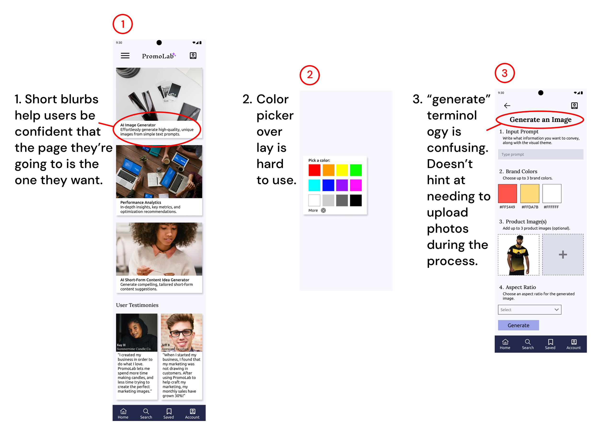

How I Increased Clarity
Changed header from “generate an image” to “create an image.” This put it more in-line with what users are used to seeing.
The term “generate” will only show up during the image generation stage.
Toned down colors. Got critique that colors would interfere with the colors users selected when creating their promo images.
Added text (ex. instagram post, facebook banner) next to aspect ratios to decrease confusion. (1 user was confused during testing as to what the numbers meant).
Added blurb to “create an image” page to add further clarity
Shrunk “upload photo” box to be same size as color boxes, and to fit more on screen for when users want to upload more than one image.
Added question button next to “Product Image(s)” for users who are concerned about how the AI uses and sources images.
Before
After
Color Picker Overlay
Initially, the color picker had some colors shown as a simple palette, with the option to click below for a full color wheel
I found that this confused users who wanted to pick specific colors.
updated the color picker to be more conventional and have the gradients already visible. If the user knows the hex code of their brand color, they can type it in as well.
Before
After
The Finished Product
Home
More space for text in cards. Changed shape of testimonial to fit other card shapes, added a carousel arrow if viewers want to read more.
Create Image
Everything needed to create a marketing image is housed on one screen. Users can easily go back and change any step they want. Like if they want to edit the prompt for example.
Generated Images
Users can select which generated image they want to post online or save.
Impressions
After inputting the URL of the post, users can view how their image is performing.

What Have I Learned?
Don’t be afraid to step outside of your comfort zone.
Going into this project, I wasn’t too familiar with AI or its uses. To remedy this, I played around with the features of competitor apps and tried to get a feel for the design conventions of AI products. That was where I picked up on the sparkle motif being used to denote AI features, and the thumbs up thumbs down for users to review the AI’s generated content..
Once I decided to incorporate AI elements into my product, I embraced the design challenge. I’m still by no means an expert, but I’m glad that I used the opportunity to push myself and learn about a technology that is becoming ever more important.
Focus on creating core features to avoid scope creep.
When planning this project, I initially wanted to include 5-6 features. But after getting advice from my peers, I narrowed down to 2-3 features. This helped during the prototyping process when I had to create more screens than anticipated for my main feature. If I had stuck to creating 5-6 features, I would’ve been running behind for the rest of the project and trying to make up that deficit, possibly sacrificing quality in the process. After running behind schedule in my previous project, I wanted to avoid this at all costs.


What Would I Do Differently?
Design for Depth instead of Breadth.
With AI image generation being a complex feature to create, there are lots of nuances that can be added to add the cherry on top. For example, a more robust thumbs up thumbs down rating system to train the AI with, or the option to add animation to the marketing materials for platforms that accept video, or the ability to swipe through generated images shown in different aspect ratios at once to decide which one to export.
I wish I would’ve focused on my main MVP feature form the start in order to add more polish.
Look up additional examples of AI use in industries outside of small business.
With new uses for AI popping up every day, I should have learned more about alternate uses so as to get a better grasp of what AI is capable outside of generative tasks.