


Role: UI/UX Designer, Researcher
Summary
Why Did I Choose This Project?
As a long-time Reddit user, I’ve observed growing concerns about the platform’s usability and onboarding experience. This motivated me to explore a solution that enhances the experience for both new and existing users. Building on my previous project, where I successfully aligned business goals with user needs, I recognized that improving Reddit’s onboarding process could not only enhance user satisfaction, but also contribute to expanding the platform’s user base.
How Did I Conduct My Research?
Before I started my project, I conducted an internal interview with a Reddit employee. I learned that Reddit’s business goal is to expand the userbase beyond the internet-savvy niche that the platform occupies.
From my unmoderated survey of Reddit users, I learned that community is the main theme. Anything that gets in the way of the community aspect hurts the ease of use. (karma posting restrictions, trouble finding the correct subreddit)
I used both these insights to design a feature that aimed to increase understanding and clarity around how users should use Reddit, this in turn would help the business goal of growing the userbase by having a more understood platform.
Key Learnings
Designing for an existing product was harder than I thought it would be. In past projects, I was able to choose color schemes that had good balance and contrast. For this one, my palette was more limited to bits of red, and shades of gray. I had to learn how to use the subtle grays so that I stayed within the design language of the existing app, while also keeping my designs readable.
Designing the user journey to be on-brand was a new challenge for me. Since this was my first time designing for an existing platform, I knew that having my feature fit seamlessly with the current experience was paramount. One example where I did this was the top menu. I initially had the button for my feature included in the bottom menu. But after consideration, I moved it to the top menu to be more in line with Reddit’s information architecture. The few core features have bottom menu buttons, and the rest of the features live in the top menu.
Understanding Reddit’s Business Goals
Here is what I learned about Reddit’s strengths and weaknesses in my internal interview :
Strengths:
Established in 2005, Reddit has solidified its position as a legacy internet platform, eliminating the need for traditional advertising. Its strong brand recognition and organic reach ensure users are already familiar with Reddit's offerings, making it a go-to destination for online communities.
Weaknesses:
Struggles at expanding to users who are not internet/online savvy.
Hard to break the mold and start something new. The platform has expectations based on how Reddit has historically been.
Why Are Learning Resources Important?
Reddit aims to attract and retain a diverse audience, specifically targeting users who may not be traditionally considered internet-savvy. According to “Appcues”, platforms with effective onboarding increased retention by up to 50%. To achieve this, adding features that enhance awareness of Reddit's functionalities and quirks (such as karma restrictions and differing subreddit rules) becomes crucial. By doing so, the platform can not only increase and retain the userbase, but also enhance overall satisfaction.
Auditing the Current Experience
Reddit’s onboarding consists of gauging users’ interests and styling their avatar. One area of improvement would be to offer tutorials for how to actually use the platform.
In the current onboarding, there is no instruction for how a comment thread differs from comments posted on other social media platforms, the different types of posts a user can make, the fact that each subreddit functions as a mini-community and may have their own rules, how moderators function.

“ [I had trouble] Understanding what r/ and u/ were. I used to just type “(what I want to know) Reddit” before I understood the website.”
- Reddit user 2
“Reddit was very confusing at first, especially understanding the flow of comments and replies… the chat system is terrible and many other small but annoying bugs have persisted for months. I find the avatar style area the most lacking from a UX perspective…”
- Reddit user 1


How might we make learning Reddit a stress-free, and enjoyable experience?
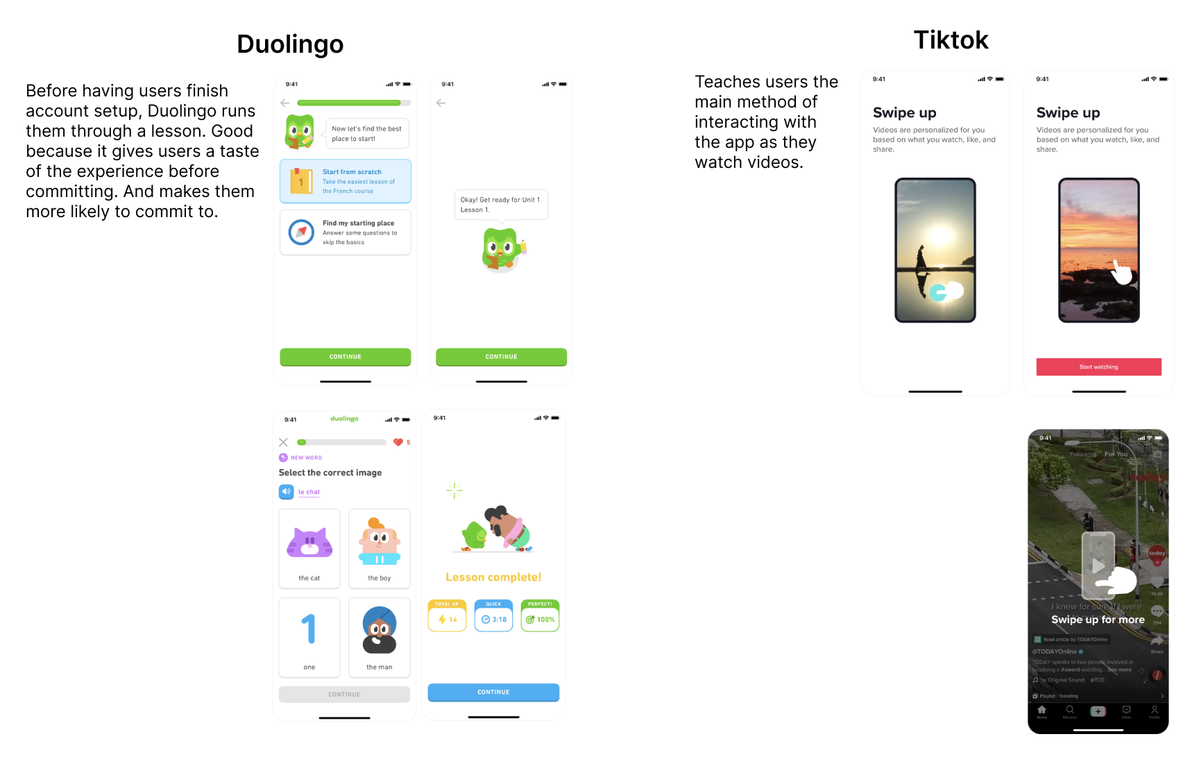
Competitive Analysis: Other Onboarding Experiences
I checked out examples of other onboarding experiences. I chose Duolingo because it is known for it’s strong gamification aspect, and because it walks users through a practice lesson. I wanted to implement hands-on learning in my own platform. I chose Tiktok because it is a good example of how to utilize on-screen commands to walk a user through the app.

Separate Communities, Common Pain Points
I conducted an unmoderated survey to hear from 46 Reddit users.
The last insight I gained was particularly interesting because it corroborated what I had learned in my internal interview. Users are not used to forum-style social media. Because Reddit is a legacy platform, those who grew up with modern social media are not used to how Reddit functions.
Since Gen Z averages 3 hours a day on social media (Oberlo), having Reddit’s features be digestible to this group is important. If Reddit can gain more users in this group, it has the potential to increase user interaction and user retention. In addition, the feature should be sticky, so that users don’t switch to a different app for their online entertainment.
Research Findings
Community is the main theme. Anything that gets in the way of the community aspect hurts the ease of use. (karma posting restrictions, trouble finding the correct subreddit).
Lots can be improved about the onboarding/new user experience.
Currently, it helps you set up your account, and points you in the direction of subreddits to join based on your interests. But it doesn’t teach users about how Reddit differs from more traditional social media experiences.
Users dislike the different rules between subreddits.
This is another aspect that catches off new users. For some subreddits, users can’t post unless they have a certain amount of karma (gained from commenting or posting). A new user might lose interest in the platform if they join a subreddit with karma restrictions and have their post blocked because their account is too new.
A tutorial for new users is wanted by current users.
Because of this, I knew I wanted to create a tool to seamlessly teach users the basics of Reddit.
Luis Struggles With Reddit’s Learning Curve
Why Gamification?
Based on my user persona, there is room to incorporate an element that both increases user understanding, while also encouraging active participation in line with Reddit’s business goals.
What Aspects of Gamification Should I Add?
After a quick competitive analysis, I decided to incorporate coins, missions, and cosmetic rewards.
Missions could be completed in order to receive coins, which would be exchanged for avatar cosmetic items.
Where to Add This Feature?
I didn’t want this new feature to be intrusive to the current Reddit experience. So I mapped out the existing flow, and my own flow to see how they’d combine.
I decided to move the “communities” button in the bottom menu to the side menu, and make the new feature accessible by the bottom menu.
I wanted to combine these learning features with a shop, to incentivize interacting with the missions and learning modules.
How Will This Integrate With the Current Onboarding Experience?
The current experience takes the user through setting up their avatar, and suggesting subreddits to follow based on their interests.
My feature will simplify the onboarding flow so that users can quickly learn about how to actually use Reddit.
Task Flow 1:
Same flow as the current Reddit onboarding experience.
Wanted to show how seamless my added feature would be, so having the first flow be an existing one would show this.
Task Flow 2:
Wanted gamification to feel satisfying while not being intrusive. Having the ability to complete missions by doing common tasks felt efficient.
Users could either go to the dashboard to see which mission to complete next, or use Reddit like normal, and collect rewards in the process.
Task Flow 3:
This is the flow for the above mentioned use case. If users want to consciously complete a mission and redeem their rewards.
Making the New Features Visible
I sketched out screens trying to decide where I wanted this new feature to reside in the app.
Visualizing the New Screens
Learning Modules
Where all the missions are located. Progress bars included for quick viewing.
Missions Dashboard
The home for all gamification features. Accessible from bottom menu button.
Shop
Gold coins gained from completing missions can be redeemed here for avatar customization items or awards that users can gift to others.
Trophy Cabinet
This is where users can view their accomplishments for completing missions.

Tutorial Video
Users can also watch tutorial videos to gain coins.
To make sure the feature felt consistent with Reddit’s design language, I referenced the “Reddit Brand System”. Through this, I learned that Reddit makes use of rounded shapes, flat design, and lots of cards.
I decided to create my feature in dark mode, since that is a popular way to experience mobile apps.
Keeping Visual Consistency
The Final Screens
Missions Dashboard
Improved to have simpler cards and fit a 1-column grid.
Tooltip
This is how users will be alerted to the presence of the new feature.
Shop
Made cards bigger to fit Reddit’s design philosophy better.
Overlay
After completing a mission, users have the option to go to the shop and use their newly-acquired coins in the shop.
The Shop Page Felt Cluttered
I increased the size of the buttons to reduce clutter and increase the touchpoint size.
During usability testing, users said that the rewards system felt confusing (originally, users could receive accessories, trophies, or gold).
Removed trophies from rewards system.

Testing the Designs
3 participants. 2 new to reddit, 1 moderately experienced with Reddit.
Task Flows:
Comment on a post and collect reward.
Complete guided learning and exchange gold for a shop item.
Here’s what I wanted to test:
How easily can participants navigate the interface and complete tasks?
Are there any sections that the participants have trouble navigating/interacting with?
Are there any features that participants want, or any that they completely ignore?
“You click on what you want,
and there you go.”
-Participant 1

Research Insights
Here’s what I learned after usability testing:
66% had trouble finding shop.
100% Went to top menu for each task (when the button needed was part of the bottom menu for the first task)
100% had no trouble starting the first task of commenting on a post.
Current menu layout required muscle memory to know which screen had which menu
33% mentioned wanting a guided tutorial when first logging in to the app. Out of scope for current project, but good idea for future additions.
Updates
I moved the learning feature from bottom menu to top menu.
Because Reddit has menus in a few places on-screen, each menu houses a different set of features. Since the core features are housed in the bottom menu, it didn’t feel accurate to add my feature to the bottom menu. Yes I want my feature to be used, but this didn’t fit Reddit’s information architecture and design philosophy.
Instead, I moved it to the top menu, where users would expect to find features that are secondary to the core ones.
This also visually groups the Missions feature closed to the shop and learning modules feature, making it easier for users to continue the learning task flows without getting lost or distracted.
Clickable Prototype


Reflection
Designing for an existing product was harder than I thought it would be.
In past projects, I was able to choose color schemes that had good balance and contrast. For this one, my palette was much more limited to a bit of red, and a lot of grays. I had to learn how to use the subtle grays so that I stayed within the design language of the existing app, while also keeping my designs readable.
Designing the user journey to be on-brand was a new challenge for me.
Since this was my first time designing for an existing platform, I knew that having my feature fit seamlessly with the current experience was paramount.
One example where I did this was the top menu. I initially had the button for my feature included in the bottom menu. But after consideration, I moved it to the top menu to be more in line with Reddit’s information architecture. The few core features have bottom menu buttons, and the rest of the features live in the top menu.

What Would I Do Differently?
Simplify the rewards system.
Once I knew I was going to incorporate gamification, I should have gone back and done a second competitive analysis of gamified-specific onboarding experiences to make sure my solution had a streamlined rewards system. I learned during interviews that receiving a mix of gold, trophies, and items for completing tasks was confusing for users. I should’ve focused on one reward across the whole feature.